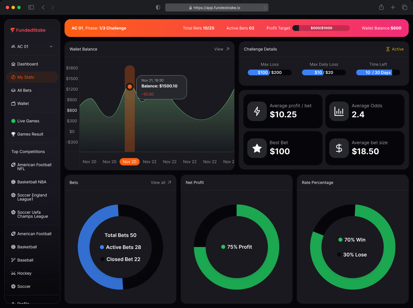
Designing a clearer sports betting challenge platform for Funded Stake
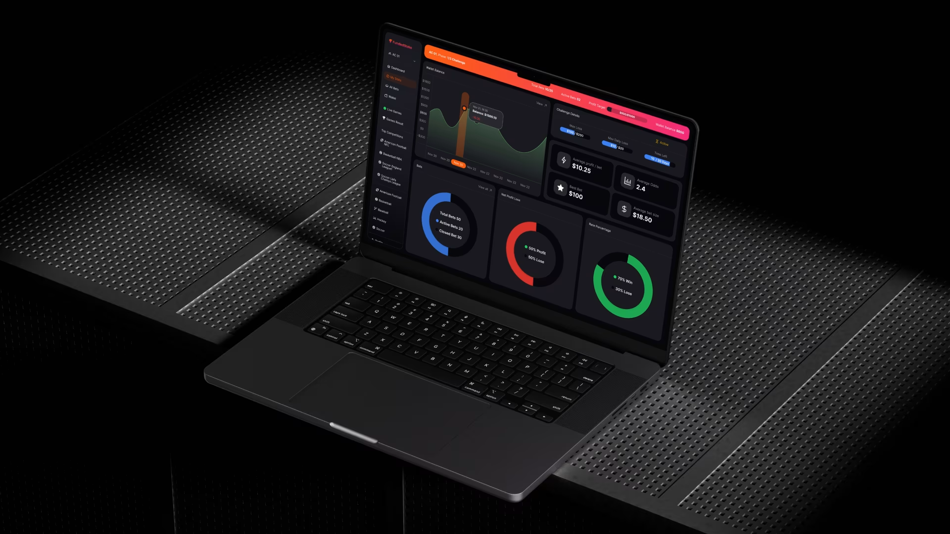
Funded Stake is a sports betting platform where users purchase a challenge, demonstrate their betting skills, and keep up to 80% of the profits without risking their own betting capital.
I led the product design process from research through launch and coordinated a team of five engineers to turn the experience into a fast, clear, and usable web application.
PROJECT DETAILS
Role: Product Design Lead and Delivery Coordinator
Platform: Responsive Web Application
Scope: Product strategy, UX design, UI design, development coordination, QA and launch
Team: Sukant Sharma and his five engineers
The challenge
Users had difficulty understanding how the platform worked from their first visit through challenge completion and payout. Important information was available, but the experience did not clearly communicate progress, wallet changes, account status, or the next action a user needed to take.
Unclear challenge progress
Users could not easily see which phase they were in, what they had completed, or what was required before they became eligible for a payout.
Confusing wallet balances
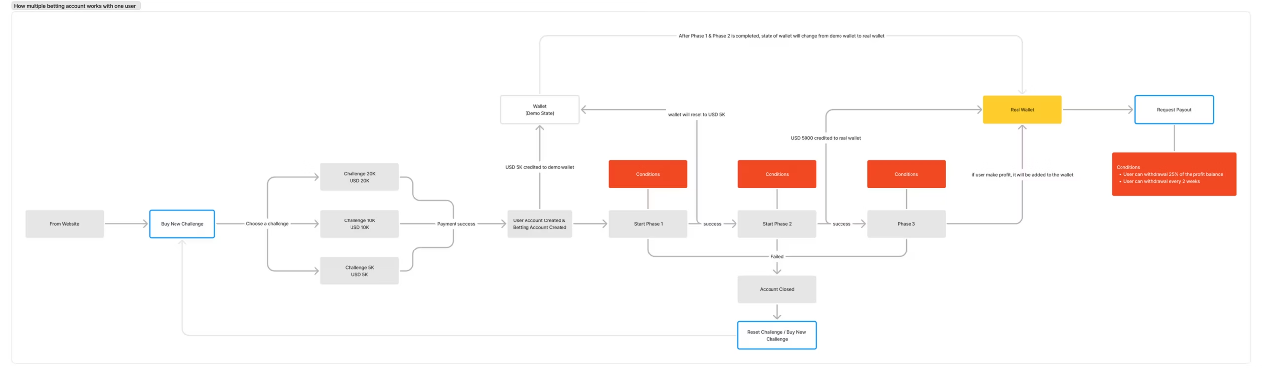
Demo and real wallets behaved differently, but the interface did not clearly explain why balances changed or how funds moved between stages.
Difficult account switching
Users managing multiple challenges had to log out before accessing another account, creating unnecessary friction.
Onboarding drop-offs
New users needed clearer guidance to understand the challenge model and confidently begin their first challenge.
The solution
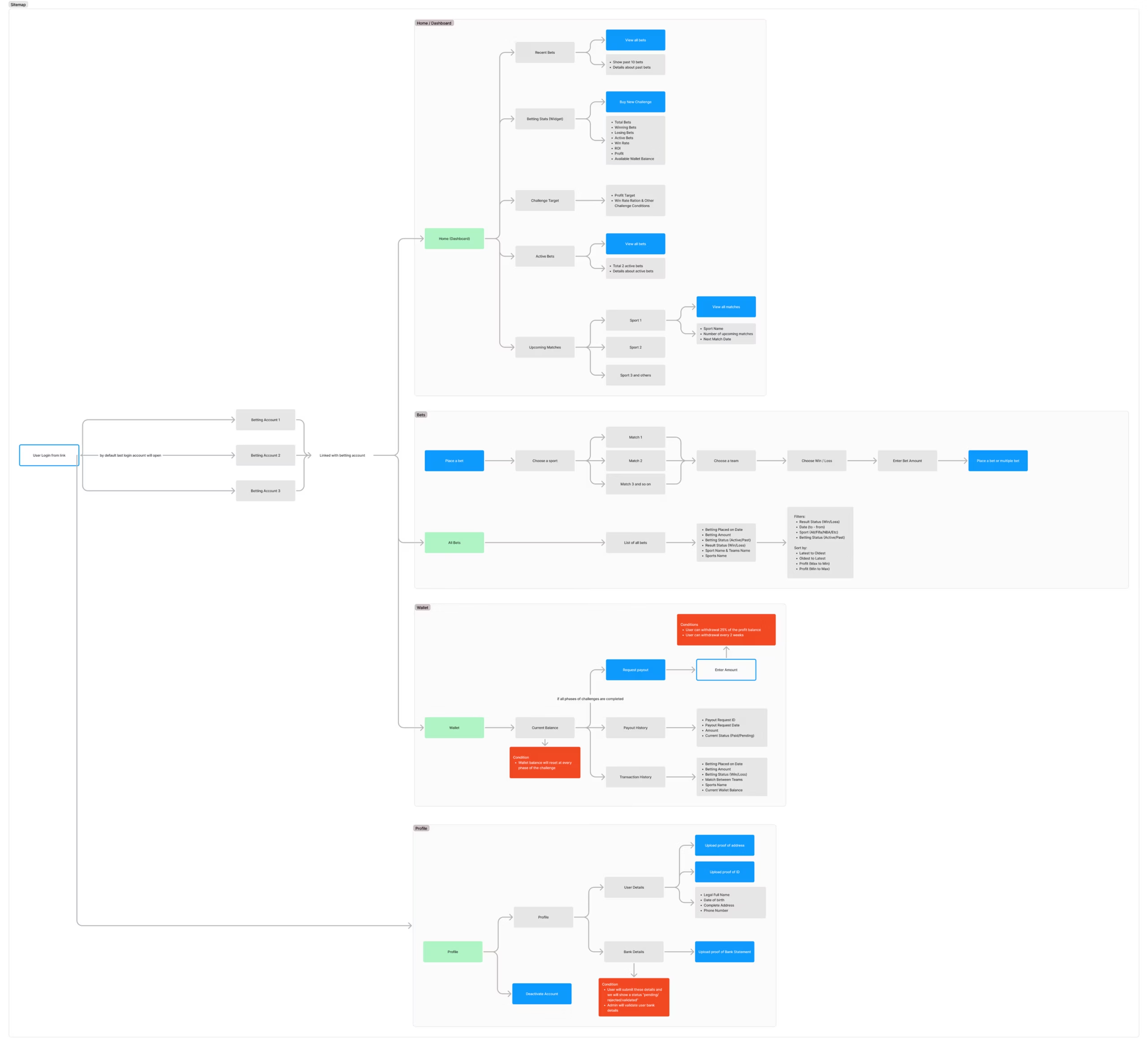
I redesigned the key journeys around clarity and progression. The new experience helps users understand their current status, see what comes next, manage their accounts, and move through each challenge with greater confidence.
Guided challenge progress
Progress indicators, status messages, and phase-specific guidance show users exactly where they are and what they need to complete next.
Clear wallet states
Demo and real wallets are visually separated through colour, icons, labels, and contextual explanations.
Simpler account management
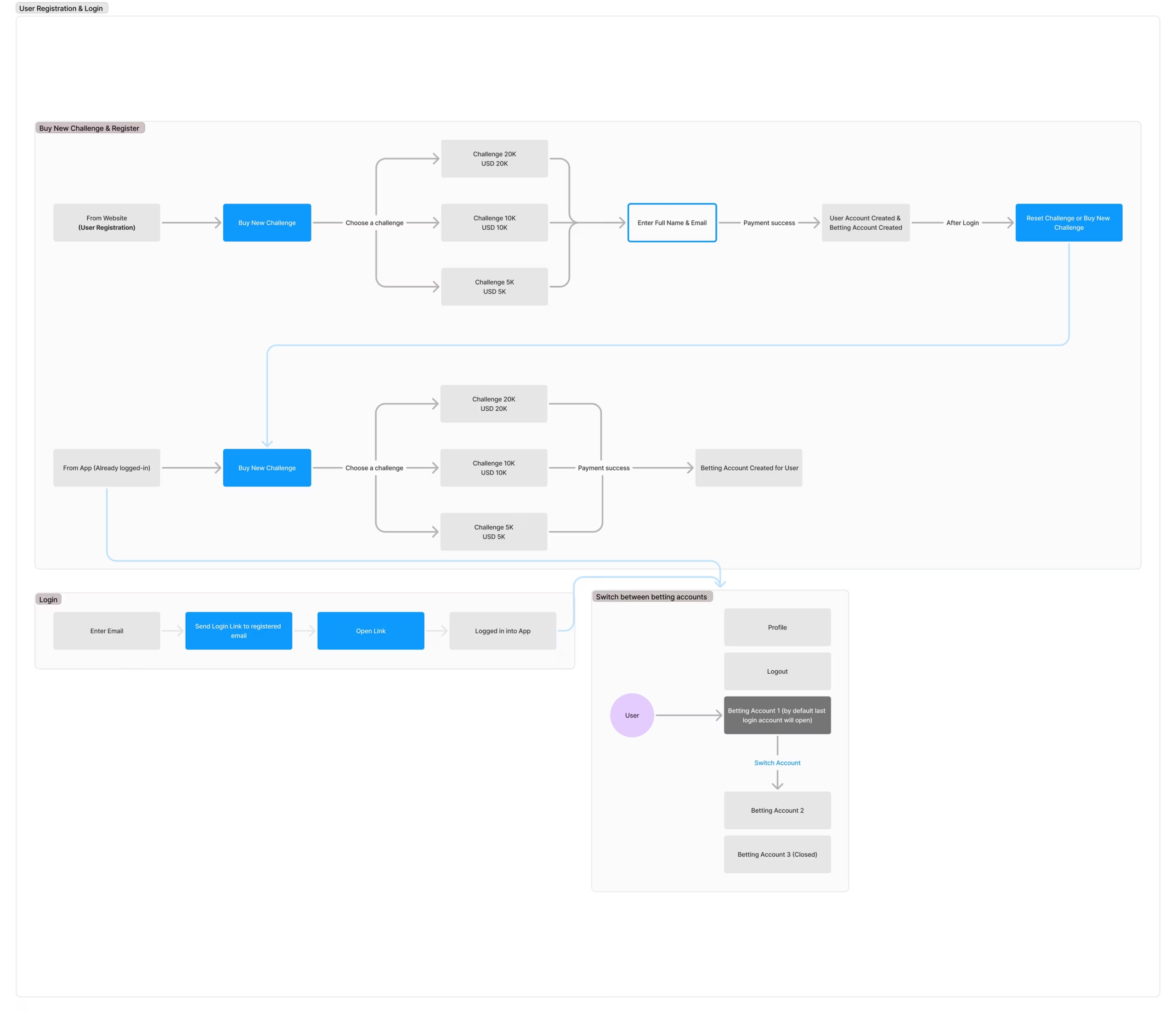
A dedicated account switcher lets users move between accounts and challenges without repeatedly logging out.
Focused onboarding
The onboarding journey was simplified to reduce unnecessary steps and explain the platform before asking users to make important decisions.
My role beyond interface design
Idea
Design
Development
Launch
My responsibility extended beyond creating screens. I helped define the product journeys, designed the user experience and interface, worked directly with the engineering team, reviewed implementation, resolved delivery issues, supported QA, and kept the product moving toward launch.
The outcome
The redesigned product created a clearer path from registration to payout. Users could understand challenge requirements, distinguish between wallet types, move between accounts more easily, and begin using the platform with less uncertainty.
Clearer challenge progress and payout requirements.
Less confusion between demo and real wallets.
Easier switching between accounts and challenges.
A simpler, faster start for new users.
What the founder said
"I’ve worked with Sukant and his team on a bunch of projects now, and honestly, it’s always been a great experience. He just gets what we’re trying to do, both creatively and from a business point of view. Communication is super smooth, and they always bring fresh ideas without missing a deadline. It’s rare to find that mix of creativity, reliability, and professionalism."