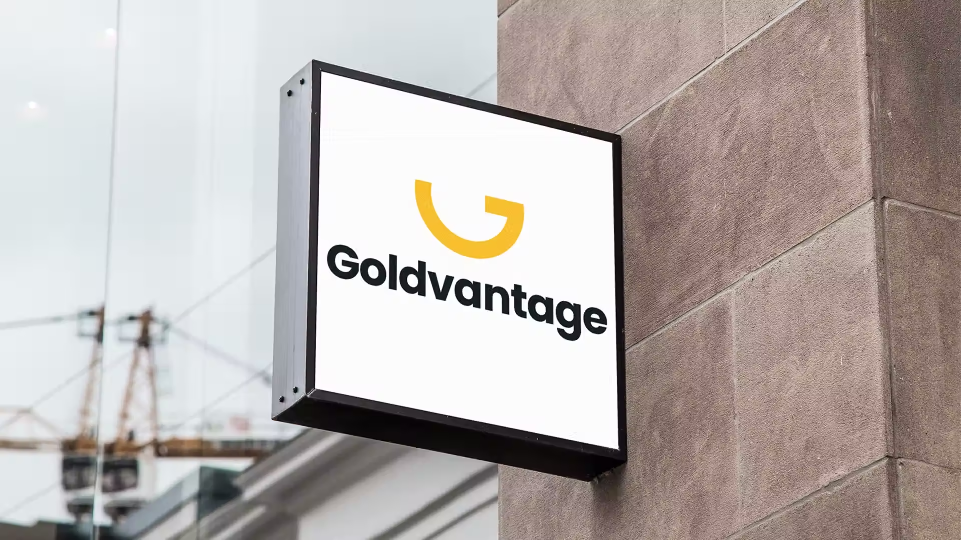
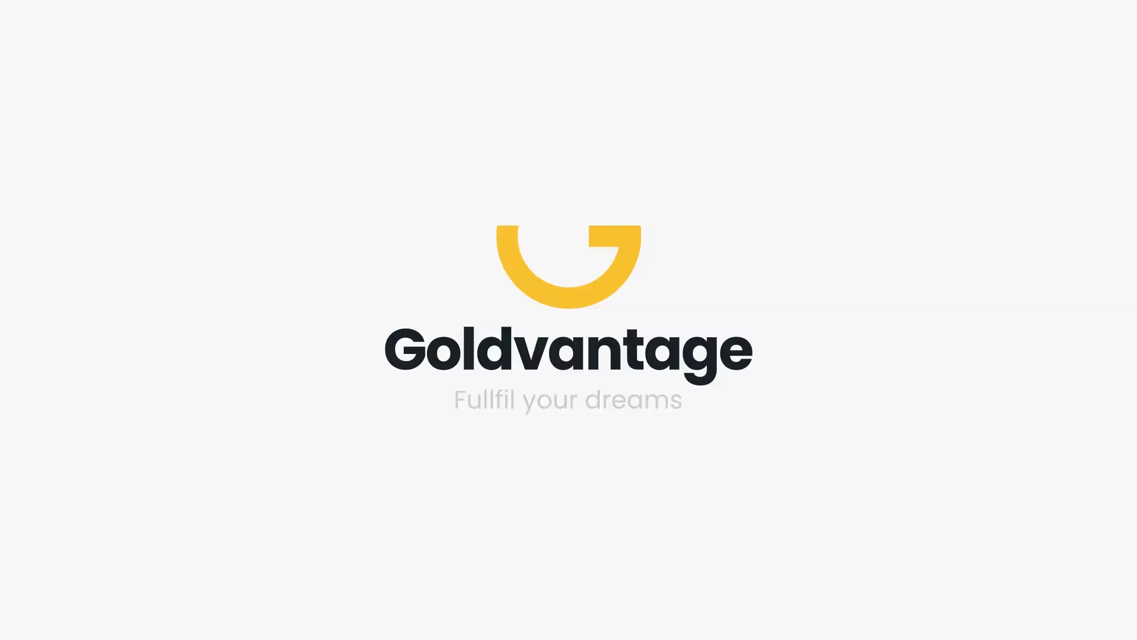
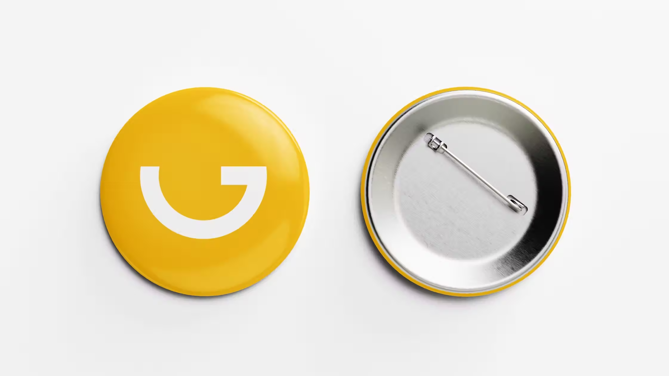
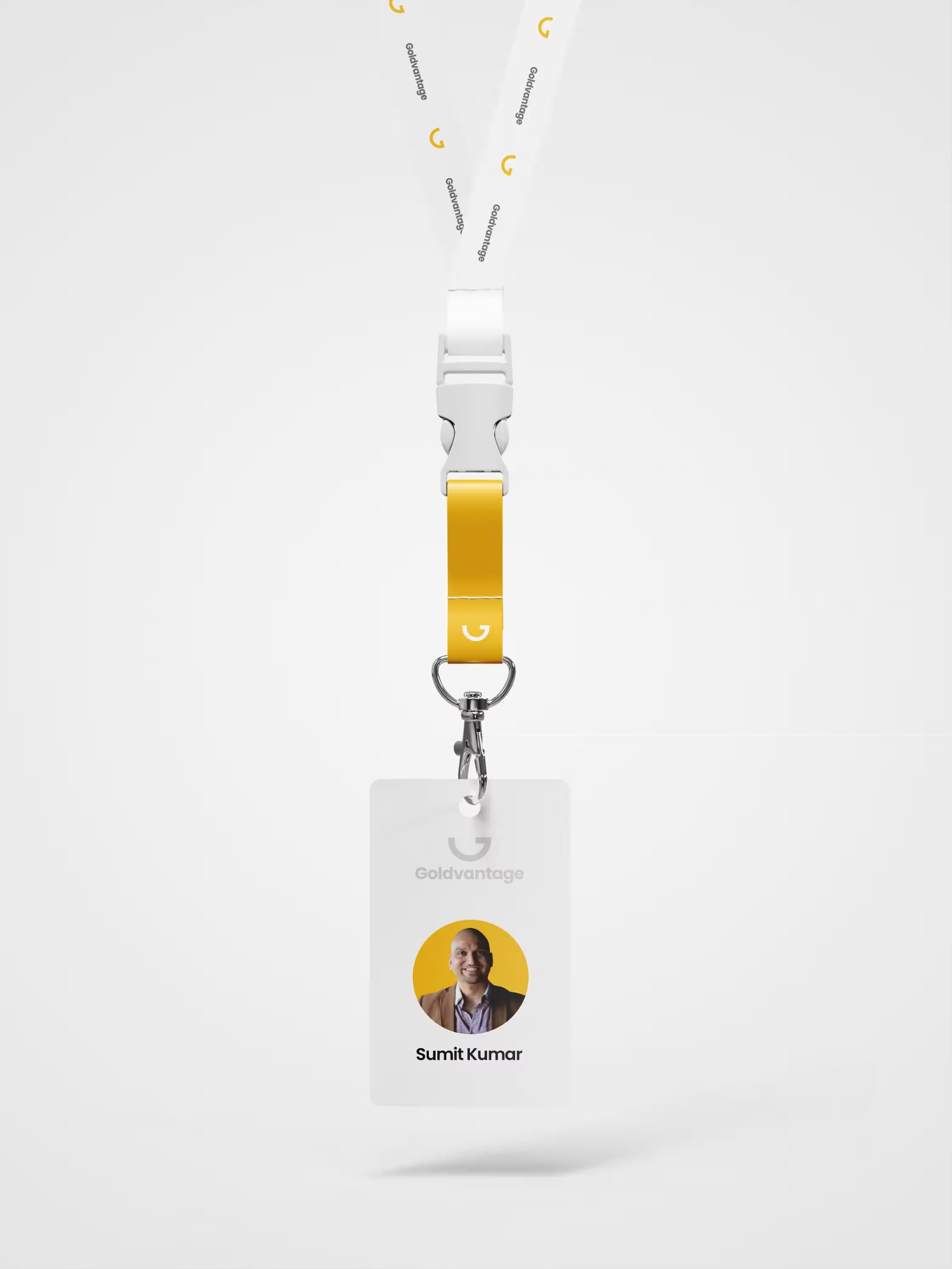
Goldvantage - Logo Design
Mumbai, India
Overview
Goldvantage is a fintech service that offers digital gold loan management — allowing customers to top up loans, renew them, and make payments entirely online. As the company transitioned to a more digital-first experience, they needed a brand identity that felt trustworthy, modern, and aligned with the convenience of online financial services.
I was brought on board to design a visual identity that would set the tone for their digital presence.
My Role
- Logo Design
- Color Palette Development
- Visual Branding Direction
Problems
Goldvantage was stepping into a competitive digital finance space but lacked a strong, memorable identity.
They needed a brand look that would:
- Build trust with both new and returning customers.
- Reflect the trust, convenience and security of online gold loan services.
- Stand out in a market filled with traditional and digital competitors.
Goals
- Create a logo that is clean, modern, and symbolic of value and security.
- Develop a color scheme that communicates trust, stability, and innovation.
- Ensure the brand identity translates well across web and mobile platforms.
Design Process
1. Research & Strategy
I analyzed the competitive landscape of gold loan providers, both traditional lenders and new fintech platforms, to identify visual patterns, clichés to avoid, and opportunities for differentiation.
2. Logo Exploration
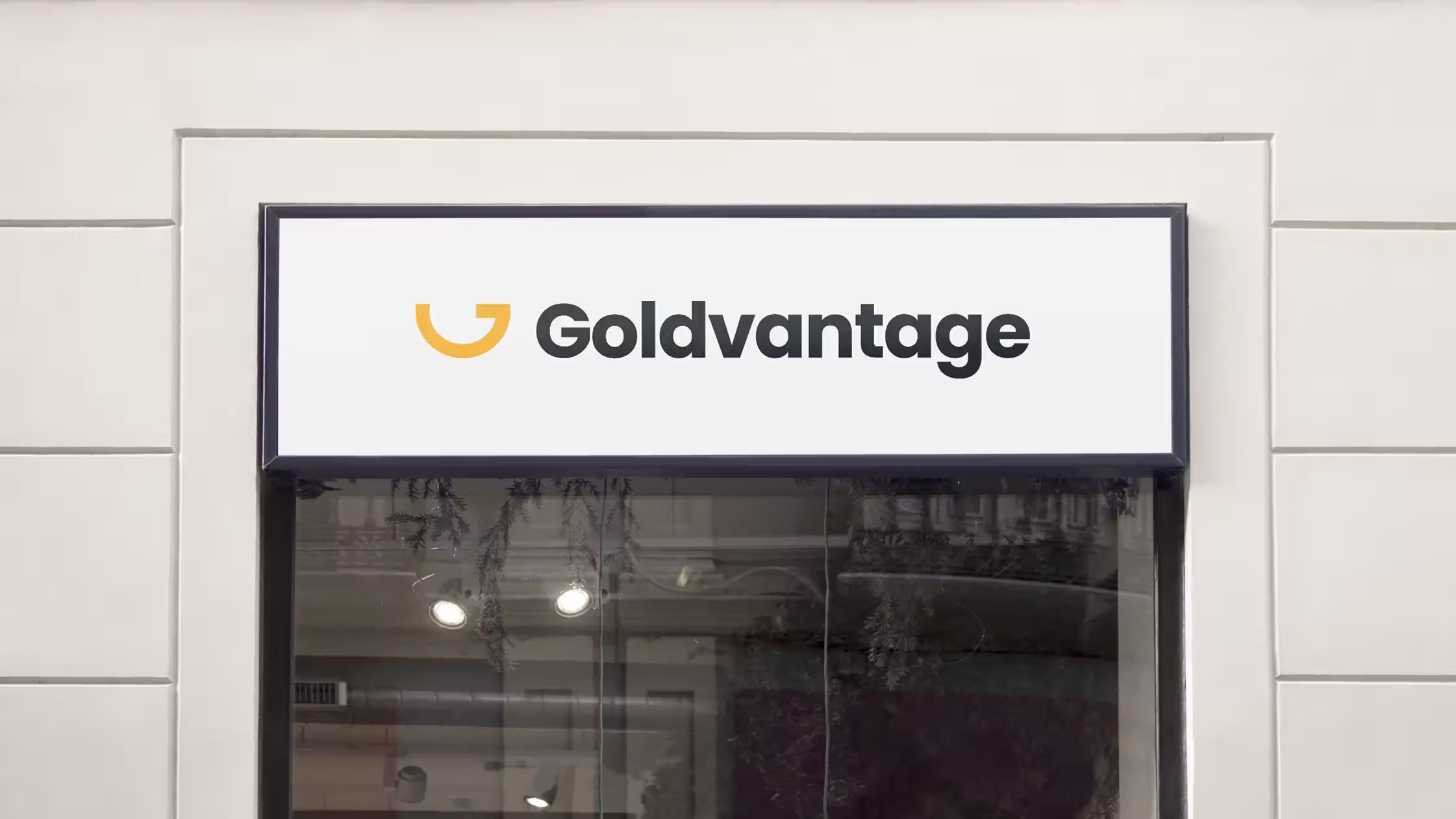
The final logo design is a balance of:
- A gold-inspired palette (to symbolize value).
- A strong geometric form (to convey structure and reliability).
- Clean typography (to enhance modernity and clarity).
- A smile-like curve, representing friendliness and approachability.
3. Color Scheme
The color palette was chosen with accessibility and emotion in mind:
- Gold as the primary color to evoke richness and trust.
- Neutral white/gray accents for clarity and contrast.
These colors help the brand appear both premium and approachable, perfect for digital platforms.
Outcome
- A logo and color scheme that positioned Goldvantage as a reliable, digital-forward solution.
- Visual assets that scaled well across app icons, payment page, and marketing materials.
- Positive feedback from the product and marketing team on brand clarity and consistency.
What I Learned
Designing for fintech is all about balancing emotional cues with functional clarity. Users need to feel both confident and comfortable when interacting with financial tools and strong branding sets that tone early.