macOS 26 Tahoe: A Design Shift and A Glimpse into the Future
24 June 2025
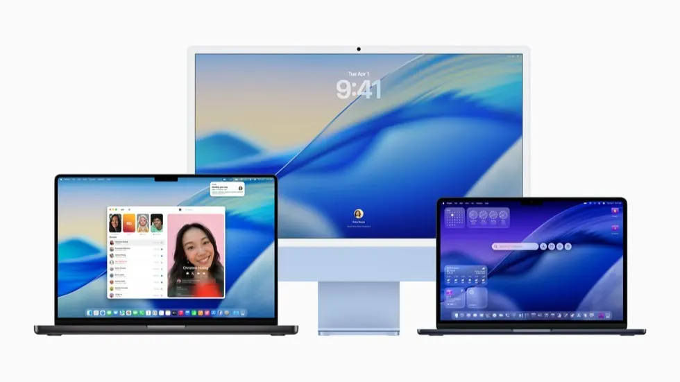
Apple’s macOS 26, codenamed "Tahoe," isn’t just another update, it’s a bold design statement that signals the future of Apple’s ecosystem. With its visually rich interface and subtle functional shifts, macOS 26 is clearly part of a larger plan. This blog explores what people love about macOS 26, where Apple’s design philosophy is heading, and how these trends might shape future devices, including the long rumoured touchscreen MacBook.
What People Love About macOS 26
macOS 26 brings a refreshing blend of nostalgia and futurism. It’s a love letter to visual clarity and user comfort. Here are the features that are getting the most love from users, designers, and developers alike:
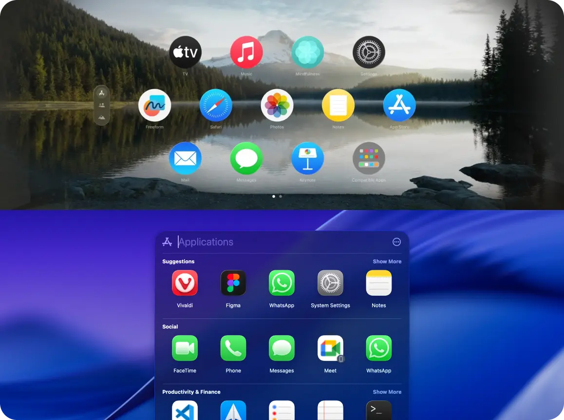
1. Rounded Corners Are Everywhere
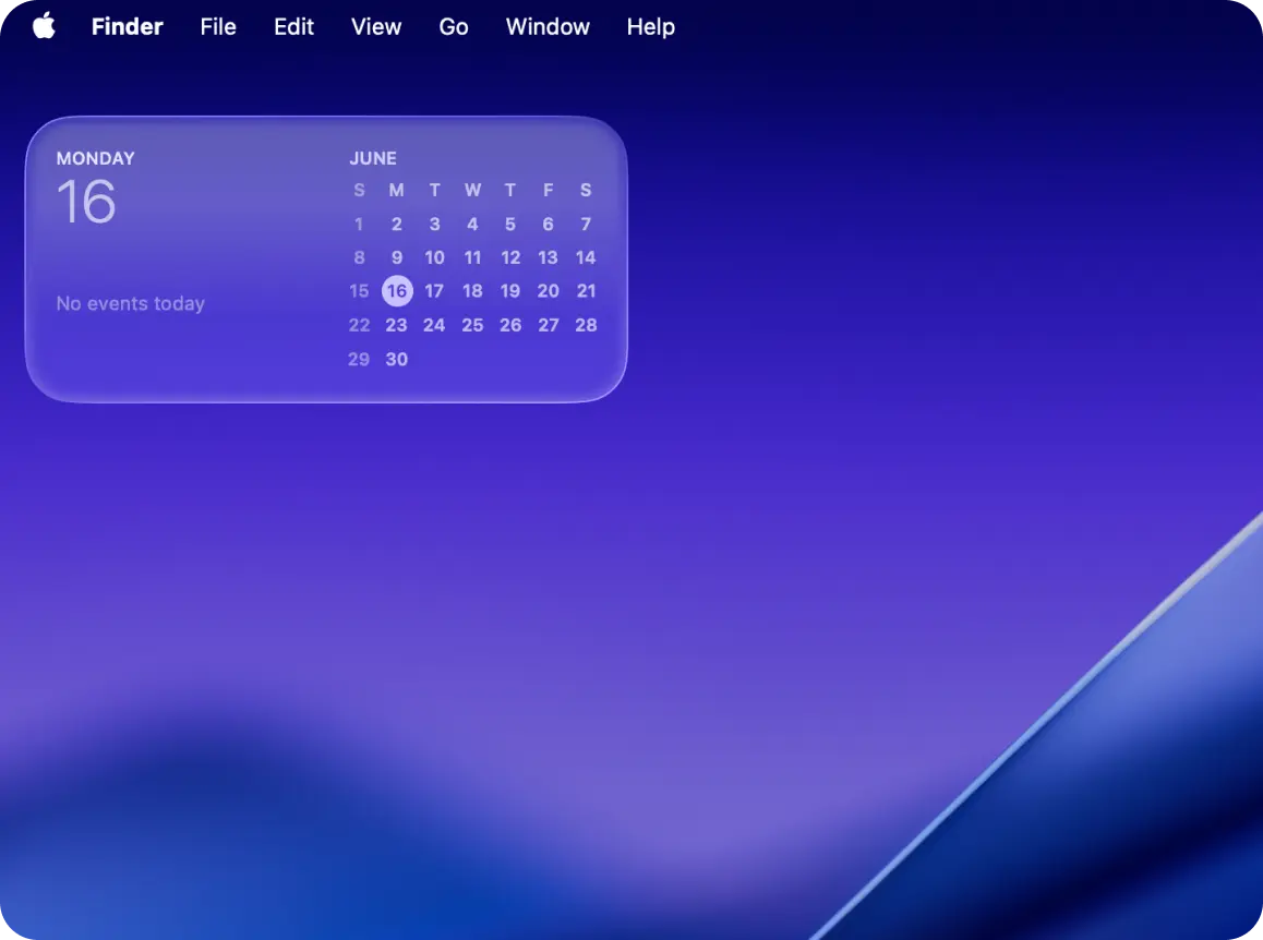
Rounded corners are no longer a subtle design detail, they’re now a dominant visual language across macOS. Windows, menus, tooltips, widgets, and even icons have adopted softer, more approachable curves.
This isn’t just aesthetic fluff. For years, Apple (and much of the tech world) leaned into rounded corner than hard edges. And there’s a psychological warmth to it. Rounded shapes are known to feel safer and more human. They reduce cognitive load and subtly guide the eye in more natural ways.
And let’s face it, we’ve been heading this way for a while. From iOS to iPadOS and even hardware like the iPhone, iPas or Apple Watch, curves have been sneaking in. Now, macOS finally catches up in full.
"Rounded corners are more than just visuals—they're about emotional comfort." – Design Systems Weekly
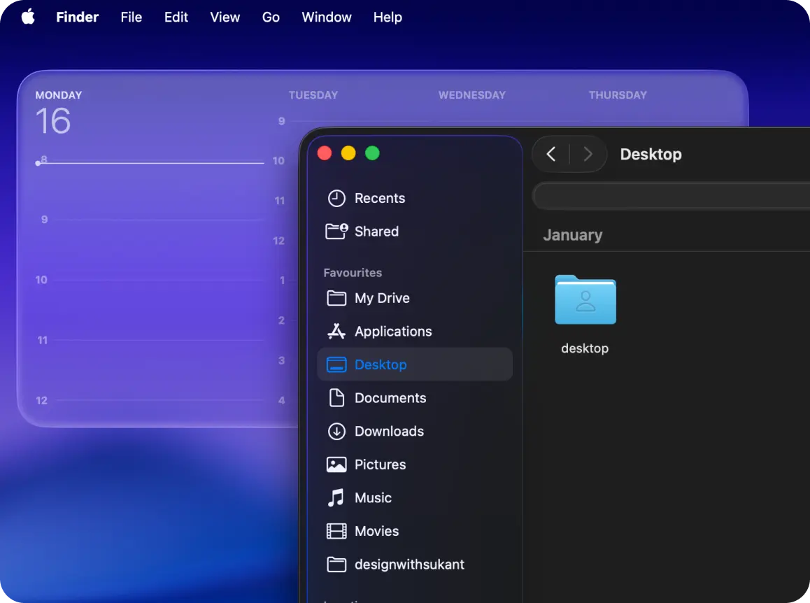
2. Bento-Style Windows: Modular, Organized, Calm
Think of app interfaces like a well packed bento box: neat, distinct, and efficient. Apps like Notes, Mail, and Calendar are now divided into clear sections, improving scannability and focus. Designers call it a win for both visual hierarchy and multitasking.
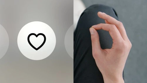
3. Big, Bold, Tappable Buttons
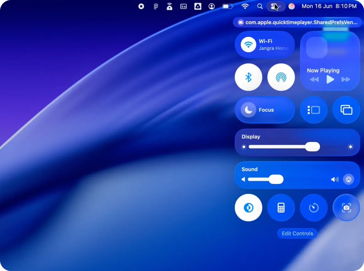
The buttons are bigger, and for good reason. They improve accessibility, make click zones easier to hit, and hint toward a future of touch interaction. Users with motor impairments or large displays especially benefit from this shift.
Take the Control Center, for example. It now looks a lot like the one on iOS, with big sliders, clean toggles, and simple icons. It almost feels like it’s designed for touch. That’s why many people think Apple is getting ready for a touchscreen MacBook or maybe even a unified Apple OS. The way things are designed now, it’s easy to imagine tapping your screen instead of just clicking it.
macOS 26 feels like it’s preparing for what’s next.
4. Liquid Glass: The Visual Soul of macOS 26
This new design system introduces elegant translucency, light diffusion, and depth creating a spatial UI that feels both futuristic and grounded. It gives clarity without distraction (yes it does.), and it subtly borrows from visionOS’s spatial layering.
The new UI feels cleaner, calmer, and more modern. Animations are smooth, transitions feel thoughtful, and spacing gives the whole OS a more breathable, user-friendly look. It’s easier on the eyes, more responsive, and better optimised for everyday workflows.
Designers see this as Apple preparing us for a future where spatial computing becomes mainstream, like Vision Pro. While you’re still using a flat screen, the OS now hints at depth and space, suggesting a UI that could eventually float in front of you, not just sit behind glass.
As a designer, it’s fascinating to see Apple gradually reshape how we interact with desktops. One thing’s for sure: change is happening.
5. Refined, Delightful Interactions
Micro interactions like hover states, pane transitions, and menu behaviour have all been polished. Animations are buttery smooth, increasing a sense of responsiveness and polish. MacOS 26 feels more alive, more aware.
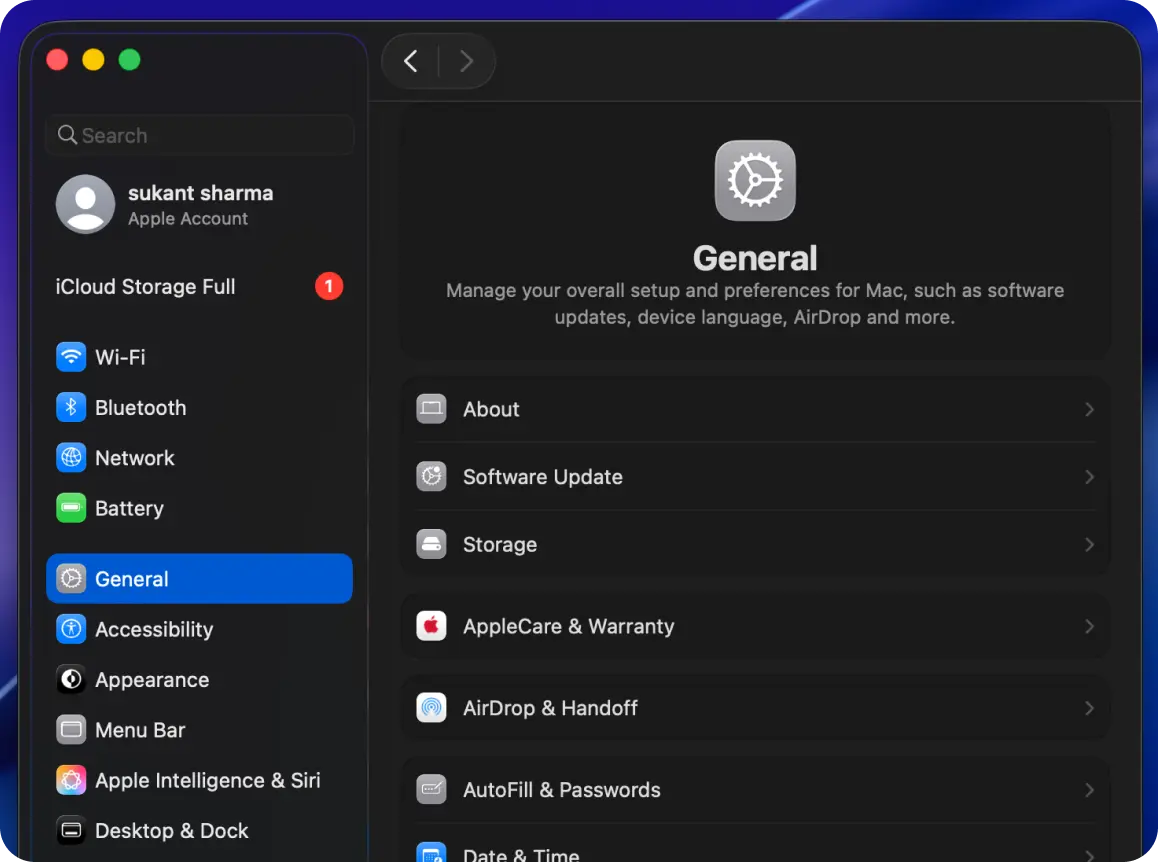
6. Customisations We’ve Been Asking For
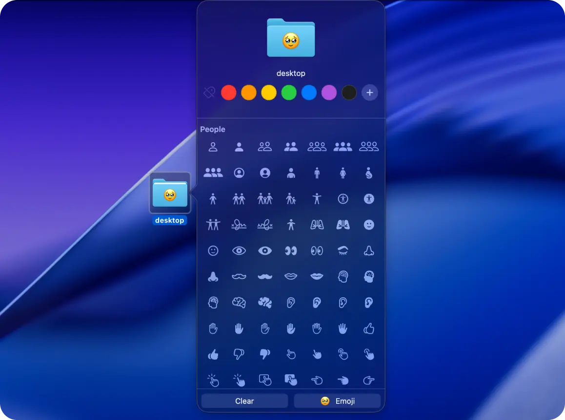
You can now add icon shapes or emojis on folder icon, set system wide themes, and personalise widget layouts. It’s a leap forward in personalisation for macOS, a platform long known for its rigid visual identity.
7. Upgraded Spotlight: Faster, Smarter, Cleaner
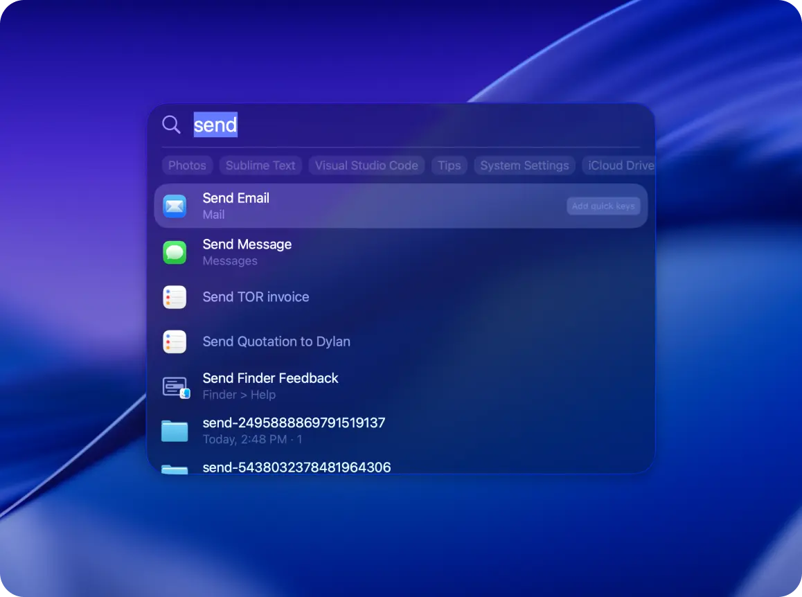
Spotlight now supports real-time previews, deeper app search, and customisable quick commands, making it the go-to productivity tool. It borrows speed and style from tools like Raycast.
8. System-Wide Design Harmony
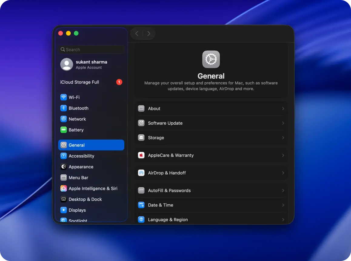
Apple’s vision of cross-device continuity takes a big leap forward in macOS 26. The Settings app now looks a lot more like iOS layouts, Control Center has been revamped, and widget behavior mimics iPadOS.
The experience of switching between a Mac, iPad, and iPhone has never been smoother. It’s beginning to feel like a single OS stretched across many screens.
The Future of Apple Design: Where Are We Headed?
macOS 26 is a bridge, not just to the next version of the OS, but to a whole new category of devices and experiences. Here’s what’s next:
1. Touchscreen Macs: No Longer a Matter of If
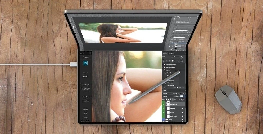
Apple has long resisted the idea of a touchscreen Mac—but macOS 26 quietly suggests that resistance may be softening.
With bigger buttons, modular UI blocks, swipe-ready gestures, and tap-friendly hit areas, it’s clear that the foundation is being laid. Many insiders believe a touchscreen MacBook—or even a foldable hybrid—is in the works for 2026 or 2027.
Apple may not say it yet, but the OS already acts like it’s ready for touch.
"macOS 26 feels like a touch-first operating system disguised as mouse-first." – The Verge Forums
2. One Operating System to Rule Them All?
Could we eventually see a universal operating system across all Apple devices?
We’re already seeing signs. macOS, iOS, iPadOS, and visionOS now share more than just design language—they share behaviors, layouts, and code structure. Developers can already build apps for multiple Apple platforms with minimal adjustments.
Expect this to continue. Apple might never publicly unify the names, but the experience? That’s already converging.
3. AR & visionOS Will Reshape macOS
visionOS isn’t just for Vision Pro. Its influence on macOS is already visible in depth layering, spatial shadows, and blurred transparency. Future updates might include spatial multitasking, 3D app previews, and even cross-device app handoff between screens and headsets.
4. The Future is Modular and Context-Aware
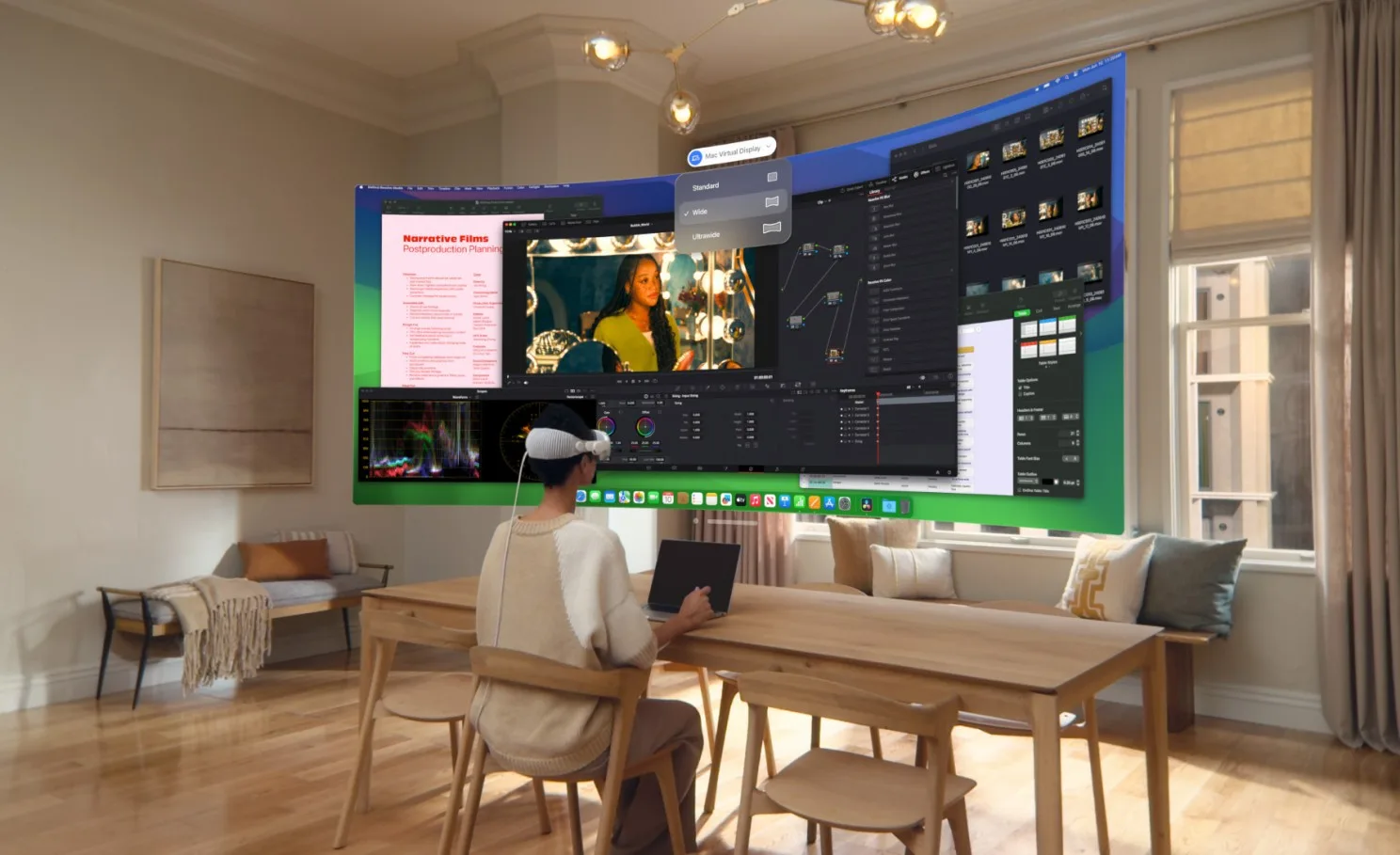
With visionOS and the Vision Pro headset, Apple is exploring interfaces beyond the screen. And now, those ideas are bleeding into macOS, layered interfaces, translucent panels, parallax motion, and depth cues.
Future Macs could include gesture-based controls, eye tracking, and spatial widgets that respond to your environment. macOS 26 is quietly preparing us for a 3D design era.
5. Natural Input Will Lead the Next Wave
Voice, gesture, and spatial input are being gradually tested through Siri, accessibility settings, and the Vision ecosystem. macOS will likely gain new modes that adapt UI based on whether you’re touching, typing, talking, or even looking.
🎨 Design Trends That Define 2026 (and Beyond)
Apple isn’t following trends. It’s creating them. And based on what we see in macOS 26, here’s where digital design is heading:
1. Rounded Everything
Everything’s getting rounder, from menus to modals to hardware itself. It reduces visual fatigue and signals friendliness. Expect buttons, icons, corners, even tooltips to embrace this pill-like softness.
2. Bento-Style Grids
Modular design helps apps stay clean, focused, and mentally digestible. We’re seeing it in finder, media players, settings, and system panels.
3. Glassmorphism 2.0
No longer just a trend, glassmorphism is now Apple’s core visual identity. It allows for both context and depth while keeping interfaces light. Expect deeper customisation of blur intensity, glass reflections, and color tinting in future of design world.
4. Spatial and Responsive Design
Apple is designing not just for screens, but for space. Layouts adjust based on device type, orientation, and proximity. Future updates may include interfaces that “react” to the angle of view, ambient light, or even eye tracking.
5. Any Screen, One Design Language
From Apple Watch to Vision Pro, interfaces scale beautifully. Apple is clearly building a unified design system that feels consistent no matter what device you're using. Whether you're checking a widget on your watch or multitasking on your Mac, the layout, typography, and gestures feel familiar. This makes switching between devices seamless and intuitive.
6. Design Powered by AI
The UI adapts in real-time to your habits, needs, and environment. With features like smart suggestions, adaptive widgets, and dynamic search, macOS 26 quietly learns how you work. Over time, the system starts anticipating what you need, whether it’s surfacing a document at the right moment or reorganising widgets based on time of day. It’s subtle, but it makes the experience feel more personal and efficient.
Final Thoughts: macOS 26 Isn’t Just a Release. It’s a Roadmap.
More than just a version number, macOS 26 signals a turning point in Apple’s design language, one that’s soft, modular, responsive, and emotionally aware.
Share this blog