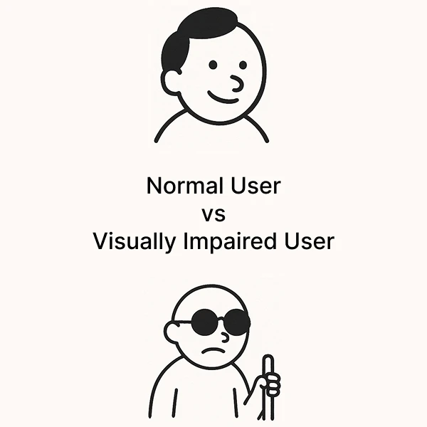
Normal User vs Visually Impaired User: Why Accessibility Should Be a UX Priority
28 June 2025 | By Sukant Sharma – Freelance UI/UX Designer
In today’s digital-first world, your website or app is often the first impression your brand makes. But here's a question founders and designers must ask:
Is your product usable by everyone, including visually impaired users?
If not, you could be unintentionally excluding a large portion of your audience, affecting not just usability but also your brand reputation, SEO, and even legal compliance.
Why Accessibility in UX Design Matters
- 285+ million people worldwide live with visual impairments (WHO).
- Accessible websites rank better in SEO, load faster, and are easier to maintain.
- Inaccessible digital products can lead to legal issues under accessibility laws like WCAG, ADA, and EN 301 549.
- Most importantly, good accessibility is good UX, it helps everyone, not just users with disabilities.
Whether you're a founder building your MVP or a designer shipping your next UI, accessibility is not optional, it's essential.
Normal vs Visually Impaired User Experience
| Experience | Normal User | Visually Impaired User |
|---|---|---|
| Navigation | Clicks on menu items or buttons | Tabs through elements or uses screen reader landmarks |
| Images | Sees images instantly | Hears alt text via screen reader |
| Forms | Reads placeholder or label text visually | Requires properly labeled inputs, error handling |
| Contrast | Can read low contrast text | Might not see text at all if contrast is poor |
| Pop-ups / Modals | Instantly notices popups visually | Needs screen reader focus shift and announcement |
| Charts / Graphs | Understands visual data quickly | Needs textual summaries or accessible tables |
| Links | Clicks "Click here" easily | Requires descriptive links like “Download the report” |
Common UX Challenges for Visually Impaired Users
- Inadequate Color Contrast: Stick to at least 4.5:1, ideally 7:1 for legibility.
- Missing Semantic Structure: Use proper HTML tags and landmarks.
- No Alt Text: Every meaningful image needs alt text.
- Broken Keyboard Navigation: Ensure everything works via Tab/Enter/Arrow keys.
- Poor Form Accessibility: Use proper labels, error messages, and ARIA where needed.
How Founders & Designers Can Build Accessible Experiences
- Use Semantic HTML
- Add Keyboard Support
- Write Meaningful Link Text
- Support ARIA Where Necessary
- Provide Text Alternatives
- Test with Screen Readers (VoiceOver, NVDA, ChromeVox)
Accessibility Improves SEO, UX & Brand Trust
- SEO: Google bots read pages like screen readers. A well-structured, accessible site is more indexable and ranks higher.
- UX: Improved clarity, navigation, and feedback help all users.
- Trust: Accessible design reflects an inclusive, human-first brand ethos.
Final Thoughts
Accessibility in UX design isn’t just a checkbox on your product roadmap. It’s a mindset. A responsibility. And a business advantage.
Great design isn’t just usable for some — it’s usable for everyone.
As a freelance UI/UX designer, I help startups and teams build inclusive, scalable, and user-friendly digital products. If you’re building a product and want to ensure it's accessible from the start, let’s work together, book a free call.
Share this blog